

The New York Islanders’ fan jersey contest has drawn more than 66,000 submissions as of July 15, 2026, after its July 8 announcement. That response shows why team jersey design online matters now: teams can invite their communities into the creative process, then turn a strong idea into a practical, professional uniform.
What the Islanders’ Contest Says About Fan-Led Design
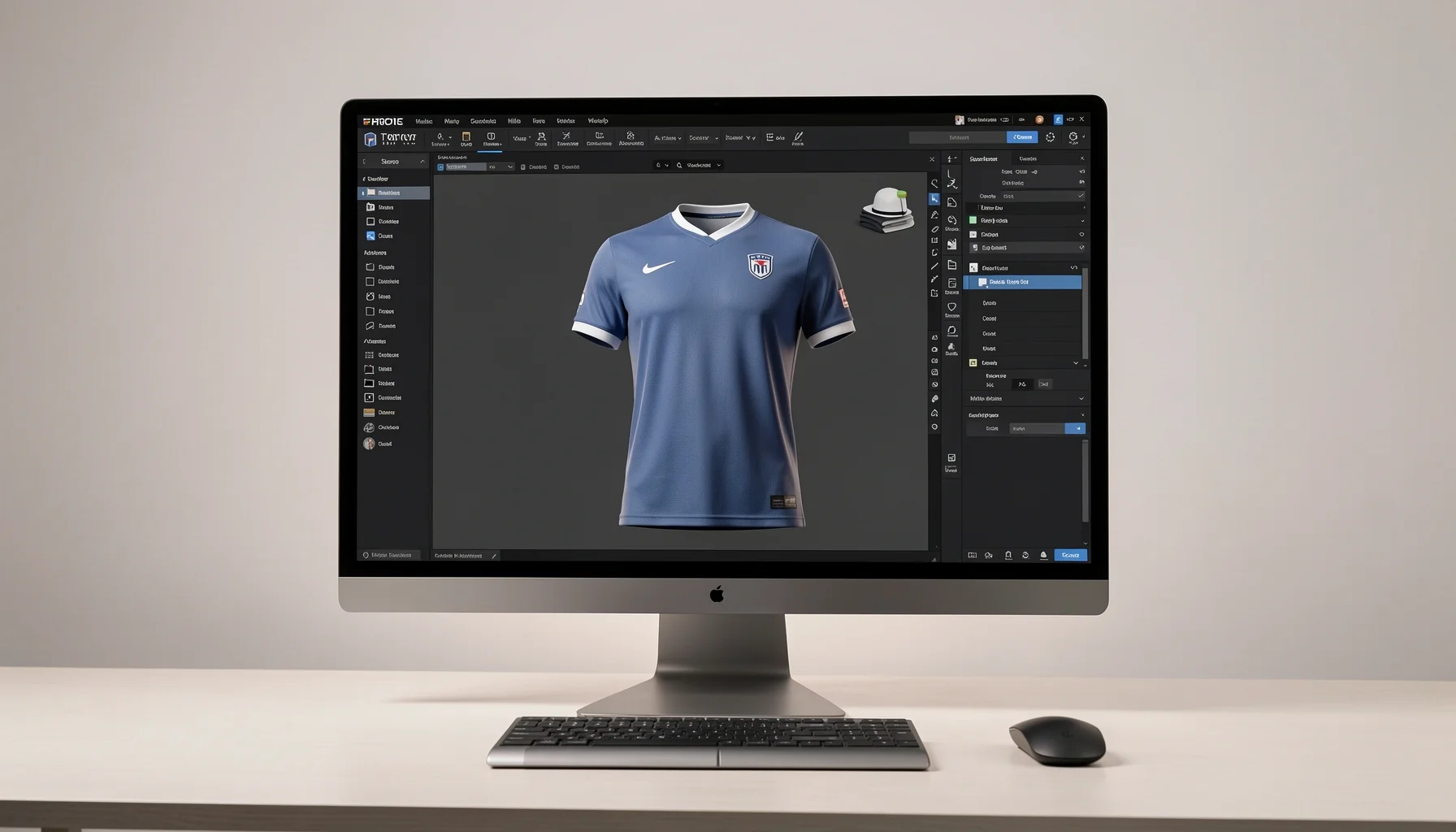 Top Trends in Team Jersey Design Online for the Upcoming Season - How to Design a Professional Team Jersey Online
A large fan response is more than a headline: it shows how team apparel can become a shared creative project rather than a decision made behind closed doors. For amateur teams, clubs, and fan groups, the useful lesson is not to copy a professional franchise’s resources, but to build a manageable process that gives participants a meaningful voice.
 Top Trends in Team Jersey Design Online for the Upcoming Season - What the Islanders’ Contest Says About Fan-Led Design
Why 66,000 submissions matter
The New York Islanders announced a fan design contest for a third jersey intended for the 2027–28 season on July 8, 2026. Newsday reported more than 66,000 submissions by July 15. Those figures indicate substantial interest in contributing to a high-profile team identity—but they do not establish that every entry was production-ready, or that large contests are necessary for smaller teams.
Coverage from NHL.com and The New York Times / The Athletic on July 8 framed the initiative as a way to involve fans in a professional design decision. The broader implication is that people care not only about wearing team apparel, but also about seeing their ideas, memories, and visual preferences considered. For local teams, that can translate into a short, focused design vote, a sketch challenge, or a discussion about colors and heritage details.
The practical distinction is important: participation creates engagement; a clear design process creates a usable jersey. Teams still need to evaluate legibility, color contrast, production methods, and consistency across different sizes.
What a fan contest can—and cannot—solve
A fan-led process helps surface ideas that a small leadership group might overlook. Supporters may favor a familiar club color, a local landmark, a meaningful year, or a symbol that reflects the team’s history. Involving players and fans early can also make the final design feel more representative.
However, a popularity vote alone cannot assess every technical requirement. A design may look compelling on a screen but prove difficult to read at game distance, or rely on fine detail that does not translate cleanly into a garment. For that reason, separate creative input from technical approval.
A workable selection process might be:
- Ask participants to submit concepts or vote on a small set of themes.
- Shortlist ideas against a written design brief.
- Review the strongest concepts for readability, color use, and production feasibility.
- Share a refined proof for final feedback before production.
This approach gives the group a voice without asking a vote to do the work of a production review.
How smaller teams can adapt the model
A youth club or recreational league does not need thousands of entries to benefit from fan-driven design. A team can invite a few concept proposals, run a simple poll, or collect feedback from players and families. Keep the prompt specific: identify the team’s key colors, the intended use, any heritage element worth preserving, and the details that should remain easy to read.
Set expectations before gathering submissions. Explain whether participants are choosing an overall direction, a crest treatment, or a particular accent—not all three at once. A bounded brief produces more comparable ideas and makes it easier to reach a decision.
Legendkits’ perspective is that the best community process is collaborative but structured. Once a team has a preferred direction, a professional design workflow can help turn it into a coherent garment rather than leaving the winning concept as an untested sketch.
The Design Trends Shaping Jerseys for the Upcoming Season
The strongest current design signal is restraint: use a clear identity, modern typography, and selected heritage details instead of filling every available area. ESPN’s July 18, 2026, World Cup jersey coverage and adidas News’ September 25, 2026, legacy-jersey update are cited in the supplied reporting as examples of interest in minimalism and commemorative design. Treat those as directional references, not a guarantee that every team should follow one aesthetic.
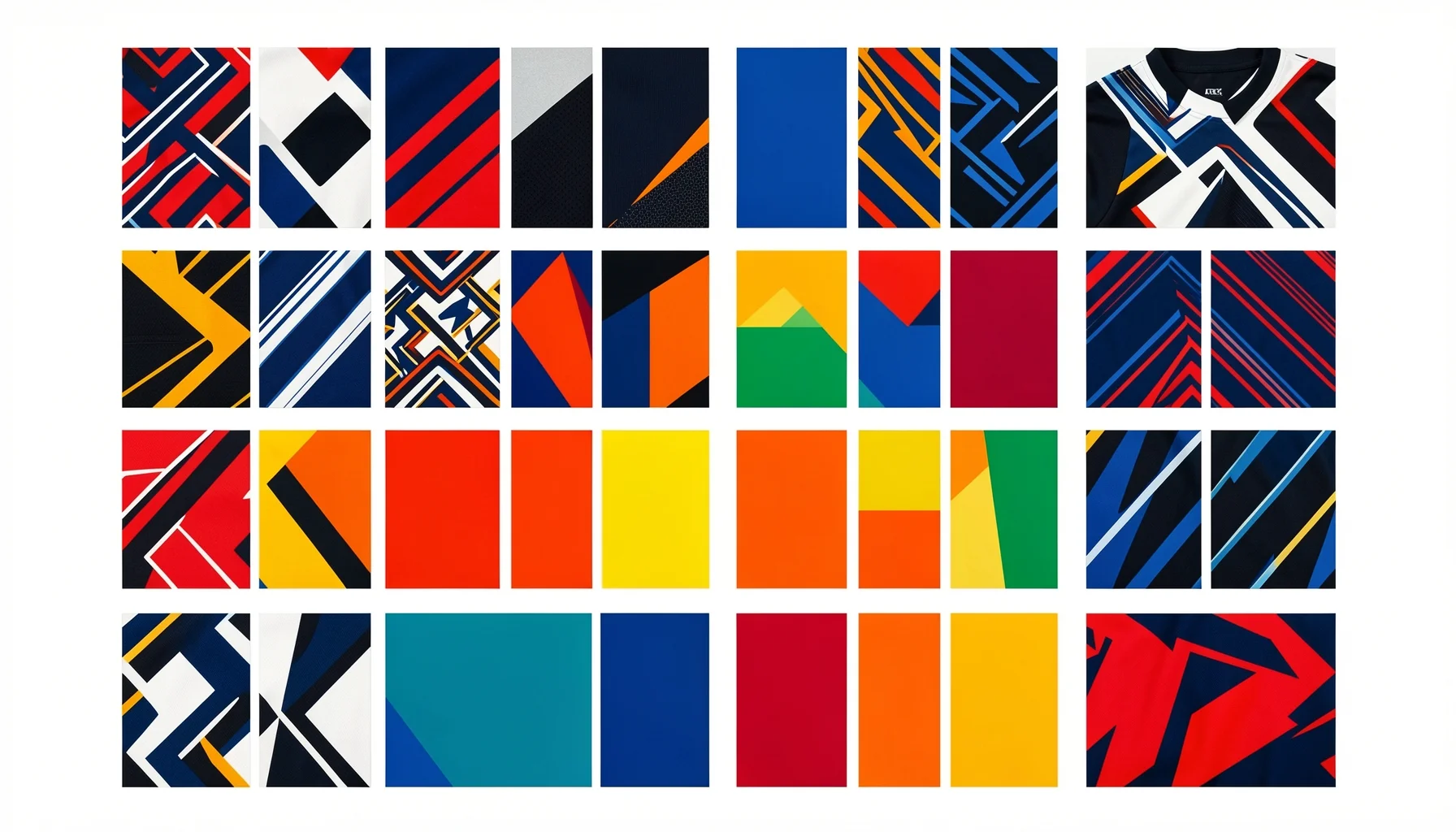 Top Trends in Team Jersey Design Online for the Upcoming Season - The Design Trends Shaping Jerseys for the Upcoming Season
Minimalism makes team identity easier to read
Minimalism is not simply removing decoration. It means prioritizing the elements that communicate identity: the team name, number, core colors, and one or two visual signatures. A restrained layout can help the most important information stand out, especially when a jersey is viewed from a distance or in a fast-moving game.
For teams exploring minimalist custom jersey ideas for teams, start by deciding what must remain. A primary color, a distinctive stripe, or a small heritage motif may be enough to make the uniform recognizable. Avoid adding several competing patterns, oversized secondary graphics, and multiple unrelated accent colors at the same time.
A useful test is to reduce the design to a thumbnail. If the jersey still looks like it belongs to the team and its main details remain visible, the visual hierarchy is probably working. If it becomes a mass of color or the name disappears, simplify the layout before requesting a final proof.
Minimalism also makes consistency easier across garment sizes. A design that depends on delicate details can become less effective when scaled or viewed on different bodies. Simple, deliberate components are more likely to preserve their visual role across a roster.
Modern typography should serve legibility
Modern typography for sports uniforms should balance personality with fast recognition. The number and team name are functional elements, not decorative afterthoughts; players, officials, coaches, and spectators need to distinguish them quickly. A fashionable typeface is not a successful choice if its shapes make similar characters hard to tell apart.
Begin with three questions:
- Can the numbers be recognized at a glance?
- Does the lettering remain clear against the jersey color?
- Does the type style complement the team identity without competing with it?
Use one main lettering style consistently, and avoid combining several fonts without a clear reason. Where a team has an established wordmark or visual identity, treat that as the reference point. Where it does not, select type that feels appropriate to the sport and club rather than chasing a short-lived trend.
Typography should also be considered alongside name and number placement. A well-chosen font cannot compensate for a crowded layout. Keep the information hierarchy clear, and check that names, numbers, and any supporting marks each have enough visual space.
Heritage details work best when edited
Legacy-inspired apparel can give a uniform emotional meaning. A team might reference an earlier color, a founding year, a familiar stripe, or a locally meaningful emblem. The goal is not to reproduce every historical element at once, but to select one that strengthens the current identity.
The cited adidas coverage points to interest in commemorative jersey design, including a tribute to Lionel Messi. For a community team, the transferable idea is to connect a design choice to a story people can explain—not to imitate a professional campaign. A small heritage detail can become a conversation starter when it is tied to the club’s real history.
Keep the distinction between heritage and nostalgia overload in view. If a jersey includes too many historical references, the core team identity may become difficult to recognize. Pair one meaningful legacy element with a clean layout, then assess the result at game distance and in a digital mock-up.
How to Design a Professional Team Jersey Online
A professional-looking result starts with decisions made in the right order. Define the team’s needs, establish a visual hierarchy, check the design for readability, and review a digital proof before production. An online workflow makes it easier to coordinate choices, but it does not remove the need for a clear brief or careful review.
Step 1: Write a design brief before choosing details
Before exploring styles, record the basic requirements. Identify the sport and intended use, the team’s main colors, the names and numbers required, any existing identity elements, and whether the garment is for players, supporters, or both. Clarify what is fixed and what can change.
This brief prevents the group from debating isolated preferences without a shared standard. If everyone knows that the jersey must preserve the club colors and keep numbers easy to read, feedback becomes more actionable. It also helps distinguish genuine design concerns from personal taste.
When planning team jersey design online, settle the concept before adjusting small decorative elements. A practical sequence is:
- Confirm the team’s core identity and use case.
- Choose a primary color and a supporting palette.
- Set the position and visual priority of names and numbers.
- Add one optional motif or heritage detail.
- Review the full layout as a team before approving a production proof.
Step 2: Compare design decisions by purpose
Not every design option serves the same role. A color establishes identity, typography carries information, and a heritage detail contributes meaning. Reviewing each element by purpose makes it easier to identify redundancy and keep the design coherent.
| Design element | Main purpose | Practical review question |
|---|---|---|
| Primary color | Makes the team recognizable | Does it reflect the team identity and support clear contrast? |
| Number style | Enables quick player identification | Are the digits easy to distinguish at a glance? |
| Name lettering | Adds personalization and identification | Does the lettering remain clear within the available space? |
| Heritage detail | Connects the design to team history | Does it have a specific meaning and avoid distracting from the core layout? |
| Accent pattern | Adds visual character | Does it support, rather than compete with, the main identity? |
| Digital proof | Shows the proposed design before production | Have colors, names, numbers, and placements been checked? |
This is a decision aid, not a substitute for a garment-specific production review. A team should confirm the details on the actual digital proof rather than relying only on a sketch or poll image.
Step 3: Review the proof as a production checkpoint
A digital design proof is the point where a concept becomes a specific proposed layout. Review the names, numbers, spelling, colors, and placement carefully. Ask more than “Do we like it?” The team should also confirm that every item in the brief appears in the proof and that no unintended element has been introduced.
Legendkits provides a free digital design proof for every order before production begins. That checkpoint is useful for catching errors while changes can still be discussed. It is especially important when a team is combining feedback from players, families, or supporters.
Legendkits also offers stitched tackle twill or high-quality printing as finishing options. These are different approaches to applying design elements; teams should decide based on the intended look and review the approved design with the selected finish in mind. The proof should be treated as the final opportunity to confirm the details, not as a formality.
Turning Community Input Into a Practical Team Workflow
Community participation works best when it leads to a decision, not an endless round of revisions. A small team can use a simplified version of a professional contest: gather ideas, identify a direction, check technical requirements, and approve a final proof. The aim is to balance belonging with clarity and production readiness.
Use a compact, inclusive design challenge
A club can invite players and supporters to submit concepts, vote on themes, or suggest one meaningful design detail. Keep the task narrow enough that entries can be evaluated fairly. For instance, participants might choose between two color directions or propose a motif connected to the team’s history.
Set a deadline and establish selection criteria before the challenge begins. Useful criteria include team identity, readability, simplicity, and whether the idea can be carried across a full roster. If the team accepts complete mock-ups, explain that the selected concept may need technical refinement before it is ready to produce.
This is where the Islanders story is most relevant to smaller organizations: public enthusiasm can help a team discover what its community values. But the format should match the group’s scale. A short, well-run poll may generate more useful input for a local club than an open-ended contest with no clear brief.
Separate the vote from the final review
A vote can identify the direction people prefer. It should not be the only check before production. The selected concept still needs to be assessed for clarity, consistency, and practical execution. A two-stage process helps maintain both participation and quality:
- Stage one: Choose a concept or design direction through team feedback.
- Stage two: Review the refined proof for names, numbers, colors, layout, and finish.
Be clear about what is being voted on. If participants believe they are approving a final garment but are actually choosing a broad concept, frustration can follow. Explain which adjustments may be necessary and who has responsibility for the final approval.
This separation also reduces revision churn. Collecting every preference after a winning design has been selected can reopen decisions the group already made. Gather input at the right stage, document the outcome, and move forward with a single approved direction.
Prepare the order details before production
Before placing an order, confirm who needs a jersey and what personalization each item requires. Make one roster list with names and numbers, then assign someone to proofread it against the final design. Consistency matters: even an attractive layout can be undermined by incorrect or mismatched personalization.
Legendkits’ stated production timeline is 1 to 3 business days, with total delivery times of 6 to 11 business days. Teams should plan around that stated range and allow time to gather information, review the proof, and resolve any questions before production. The figures are not a reason to skip preparation; a complete, checked order is easier to move through the workflow.
No minimum order is available, which can help small groups or individuals obtain customized apparel without organizing a bulk purchase. For teams deciding whether a custom team apparel design service fits their needs, the practical questions are whether the service supports the required personalization, offers a suitable finish, and provides a proof for review.
A Season-Ready Strategy for Teams and Fan Groups
The strongest response to this trend is not to chase every new visual style. Teams should use community insight to define what their uniform means, then apply current design principles—clarity, restrained detail, and legible typography—to make that identity work on a real garment.
What teams should prioritize now
Begin with function and identity, in that order. A jersey is a team identifier that must work in motion, at a distance, and across a range of player sizes. The design should be distinctive, but every visual choice needs a reason.
A useful review checklist is:
- Recognition: Can teammates and supporters identify the team quickly?
- Legibility: Are numbers and names clear against the chosen colors?
- Restraint: Does every motif add meaning or improve the visual hierarchy?
- Consistency: Do all personalized jerseys feel like part of the same uniform?
- Proofing: Have the final names, numbers, colors, and placements been checked?
These questions help teams assess how to design a professional team jersey without assuming that professional appearance requires elaborate graphics. A clean design can feel intentional when the typography, color, and spacing work together.
What to borrow from the trend—and what to avoid
Borrow the process: invite community input, make decisions transparently, and test the final concept before production. Borrow the design discipline: give the most important elements room to stand out, and use heritage details selectively. Avoid copying a professional franchise’s exact visual language, assuming a viral contest format will suit every team, or treating a screen mock-up as proof that every detail is ready.
The reported Islanders figure is compelling because it shows strong interest in participating in team identity. It does not mean that 66,000 submissions are the benchmark for success. A team of 20 can create a stronger outcome with a focused brief and thoughtful review than with a large collection of incompatible ideas.
A further caution is to avoid overstating trend data. The supplied coverage identifies minimalism and modern typography as prominent design directions; it does not provide a universal percentage showing how many teams have adopted them. Use those trends as informed inspiration, then test whether they fit your own identity and audience.
The next practical move
If your team is planning a new uniform, agree on the brief before opening a design tool or collecting opinions. Choose the essential colors and identity elements, define how names and numbers should read, and decide whether community members are choosing a theme or a finished concept.
Then create a shortlist, select a direction, and request a proof that can be checked against the roster and design brief. Legendkits’ on-demand customization, free digital proof, and choice of stitched tackle twill or high-quality printing provide a route from team concept to personalized apparel. The useful sequence is simple: listen, simplify, verify, approve.
That process turns the larger trend into something actionable. A jersey does not become memorable because it uses the most fashionable typeface or the most elaborate graphic. It becomes memorable when its appearance expresses a real team identity and its details work for the people who wear it.
FAQ
What does the Islanders’ 66,000-submission figure mean for local teams?
Newsday reported more than 66,000 submissions by July 15, 2026, following the Islanders’ July 8 announcement of a fan contest for a 2027–28 third jersey. The number signals substantial interest in fan participation, not a required target for other teams. A local club can apply the same principle on a smaller scale by asking members to choose a theme, color direction, or heritage detail, then reviewing the preferred concept for clarity and production readiness.
What are the main trends in team jersey design online?
The supplied reporting points to three useful design directions: minimalism, modern typography, and selectively used heritage details. Minimalism helps create a clear visual hierarchy; typography needs to make names and numbers easy to read; and a legacy element can add meaning when it connects to the team’s actual story. These are design considerations rather than rigid rules. Teams should adapt them to their colors, sport, audience, and existing identity.
How can a small team run a fan-led jersey design process?
Start with a brief that defines the team’s colors, intended use, required names and numbers, and any identity elements that must remain. Invite participants to respond to a focused question, such as choosing a visual direction or suggesting one meaningful motif. Shortlist ideas against clear criteria, then review a refined design proof for readability, layout, and personalization. Explain in advance that a popular concept may need technical adjustments before it is ready to produce.
What should teams check before approving a custom jersey proof?
Check every name and number against a verified roster list, and confirm that the colors, placement, and layout match the approved direction. Review whether the numbers and lettering remain legible against the garment color, and confirm that the selected finishing approach suits the intended design. Legendkits provides a free digital design proof before production; teams should use that checkpoint to resolve questions and approve the details carefully rather than treating it as a routine formality.